RESEARCH
Understanding what people in the US eat, what influences their decision when buying a product and the priority they give to products that are sustainable plays an important part in the planning of the design strategy. Consumers want to know more about the food they eat. What goes into the products they buy and where they come from are becoming as important as price and calorie count.
RESEARCH | What affects the purchasing decision?
RESEARCH | Design Opportunities while Grocery Shopping
THE SELF CHECKOUT EXPERIENCE
An analysis was done to what I determined were the common parts of the self-checkout hand-held scanner system. This helped inform the strategy and design process.
RESEARCH | The existing hand-held scanner checkout system
DESIGN STRATEGY | Scope of the system
BRANDING & PARTNERSHIP
When looking at possible partners for this project, Stop&Shop seemed to be pretty aligned with what I was looking for. They’re not only trying to improve the shopping experience by introducing the ‘Scan it’ service at selected stores, but they are also making sustainability part of their goals.
IDEATION
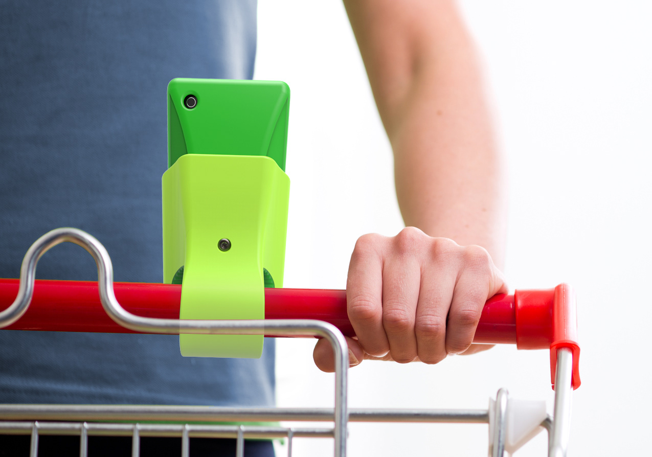
Considerations about the form and key functions of the scanner were addressed during the ideation process. Things like screen size, pointy edges and grip were some of them. Also in terms of location, is it going to be attached to a cart or can the customer bring it closer to the product shelf? In that case, is it going to be a point and shoot or does it scan the same way you take a picture with your smartphone?
IDEATION | Sketches
IDEATION | Sketch Models
Considerations about the form and key functions of the scanner were addressed during the ideation process. Things like screen size, pointy edges and grip were some of them. Also in terms of location, is it going to be attached to a cart or can the customer bring it closer to the product shelf? In that case, is it going to be a point and shoot or does it scan the same way you take a picture with your smartphone?

SCANNER | Specs
SCENARIO
Everything from how to access your scanner at the beginning of your visit, to how to scan the products you’d like to buy after getting the specific information that is relevant to you and diving through the checkout and payment process with ease.
SCENARIO | At-the-store
INTERFACE
After a role playing exercise, using other mobile apps like The Good Guide and Red Laser, a workflow became clear for the system’s interface. To be able to create or sign in to your own account, a frame that helps you target the product’s barcode, the ability to compare on different levels similar products, facilitating a quicker checkout process are some of the considerations taken for this application.